__________________
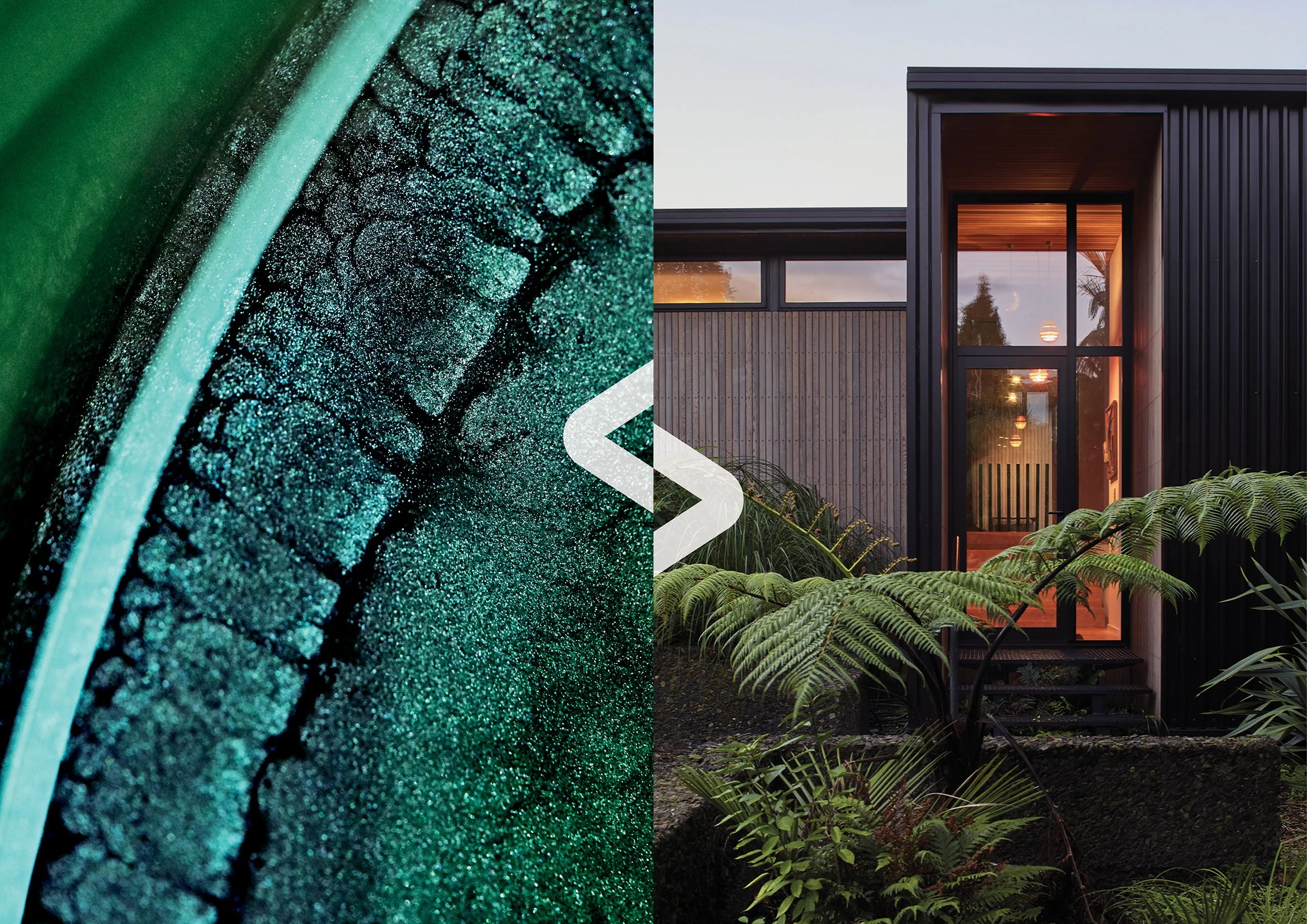
For over 35 years, COLORSTEEL® has been New Zealand’s favourite roof. But, over time they had become a generic category descriptor within a functional, low involvement category driven by price and personalities.
We created a new symbol, wordmark and brand identity that shifted the product to become a desirable lifestyle choice driven by emotion and engagement.
The new brand works to transform the way people think about building, opening them up to new possibilities in architecture that help them live more modern New Zealand lives.
Developed as Design Director at Designworks.
Design direction, design development, art direction, project management.
__________________
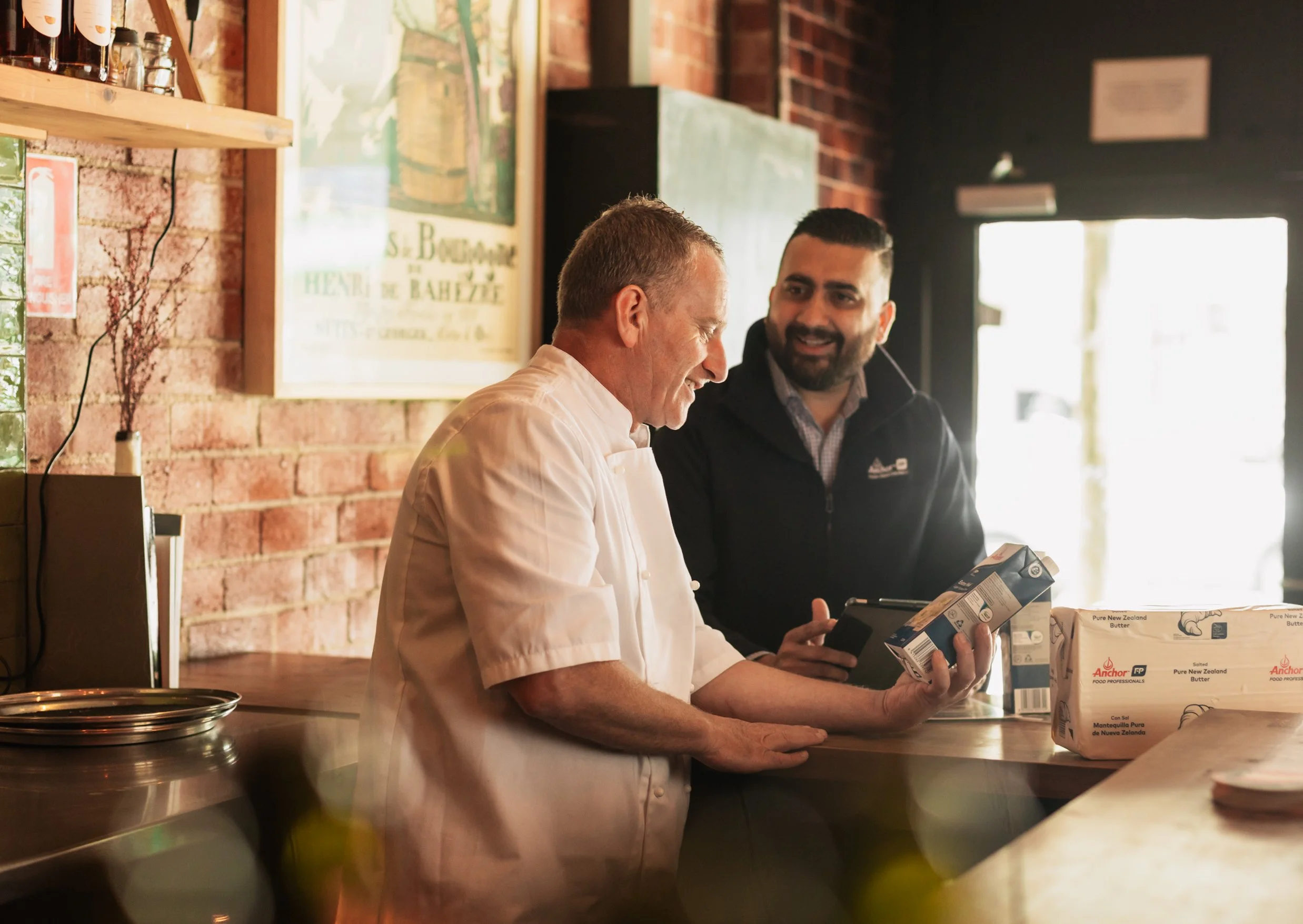
Anchor Food Professionals needed a clearer strategic insight that would differentiate and elevate the brand. The insight we discovered was that Foodservice Professionals need more than ingredients – they seek solutions from trusted partners to elevate their business performance.
We delivered a modern and refreshed brand identity based on the idea of Performance Partnership. This new brand platform has been used to deliver a significant reset for the brand, globally.
__________
As Creative Director my role included: Creative Direction, Conceptual Development, Art Direction and Strategic Support.
__________________
Global Dairy Trade (GDT) is the world’s leading online dairy ingredients auction.GDT connects buyers and sellers allowing for more transparent, trusted trade on a global scale.
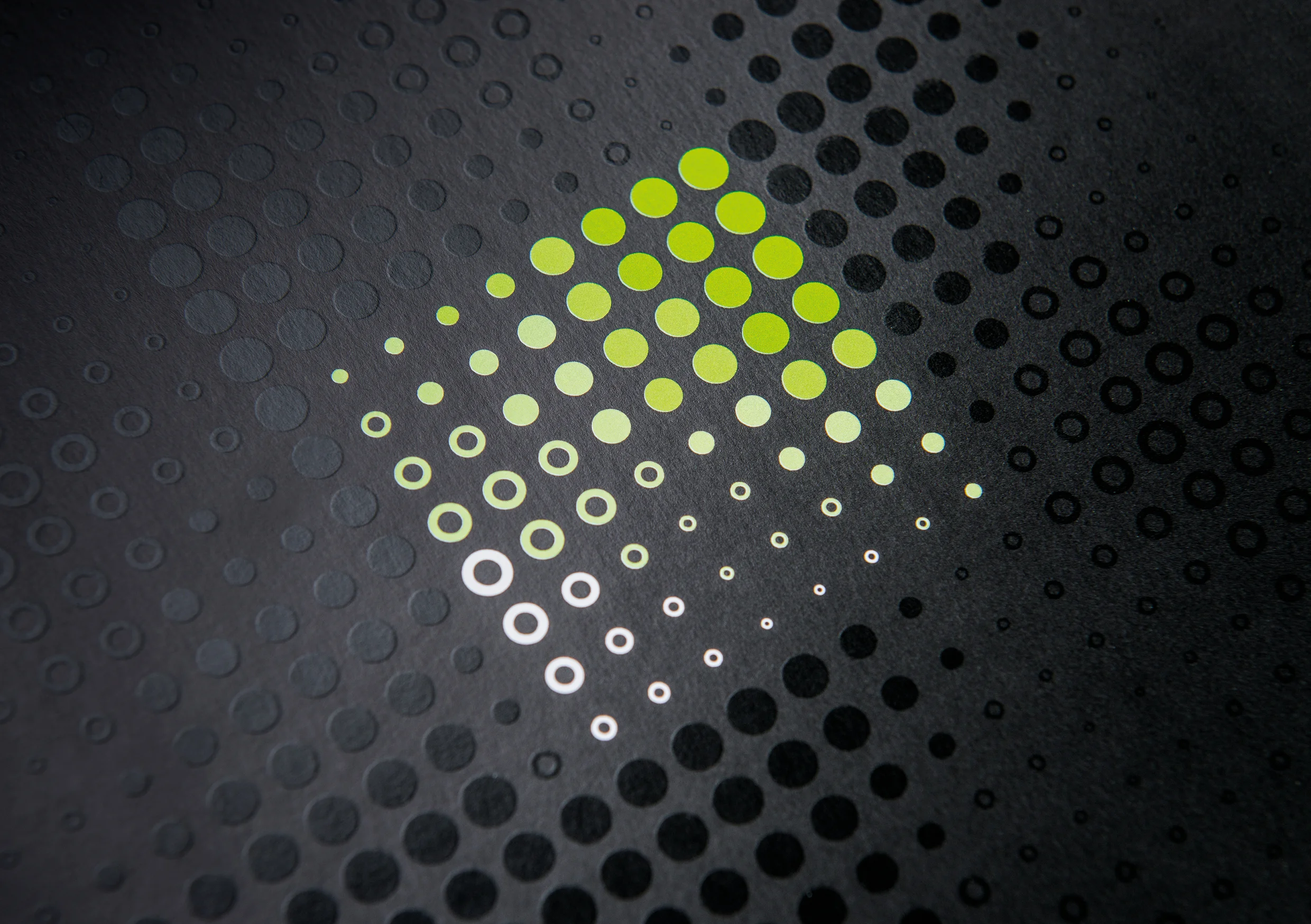
The idea behind the brand is ‘connected intelligence’ - as a brand, GDT intelligently ‘connects' buyers and sellers of dairy ingredients. The brand identity was primarily developed to communicate the launch of three new service lines; GDT Events, GDT Marketplace and GDT Insight which collectively offer a definitive product suite for connecting the world of dairy trading.
The identity uses aligned circular elements that conform to a square grid. From this grid, the identity expands and evolves and is designed to work in both static and motion formats – always aiming to show the vibrancy and reach of the connections Global Dairy Trade enables.
Developed within a larger team at Designworks.
Design direction, design development, art direction, project management.
__________________
NZMP is the business-to-business ingredients brand of Fonterra. With an annual turnover of around US$17 billion, Fonterra's core business consists of exporting dairy products under the NZMP brand.
The new brand positions NZMP as a company that 'sees dairy differently' and unlocks the natural potential of dairy, helping customers get more from their products. The brand identity uses beautiful, elegant images of NZMP's product groups to communicate this idea and elevate NZMP beyond the role of commodity supplier.
Developed within a larger team at Designworks.
Design direction, design development, art direction, project management.
__________________
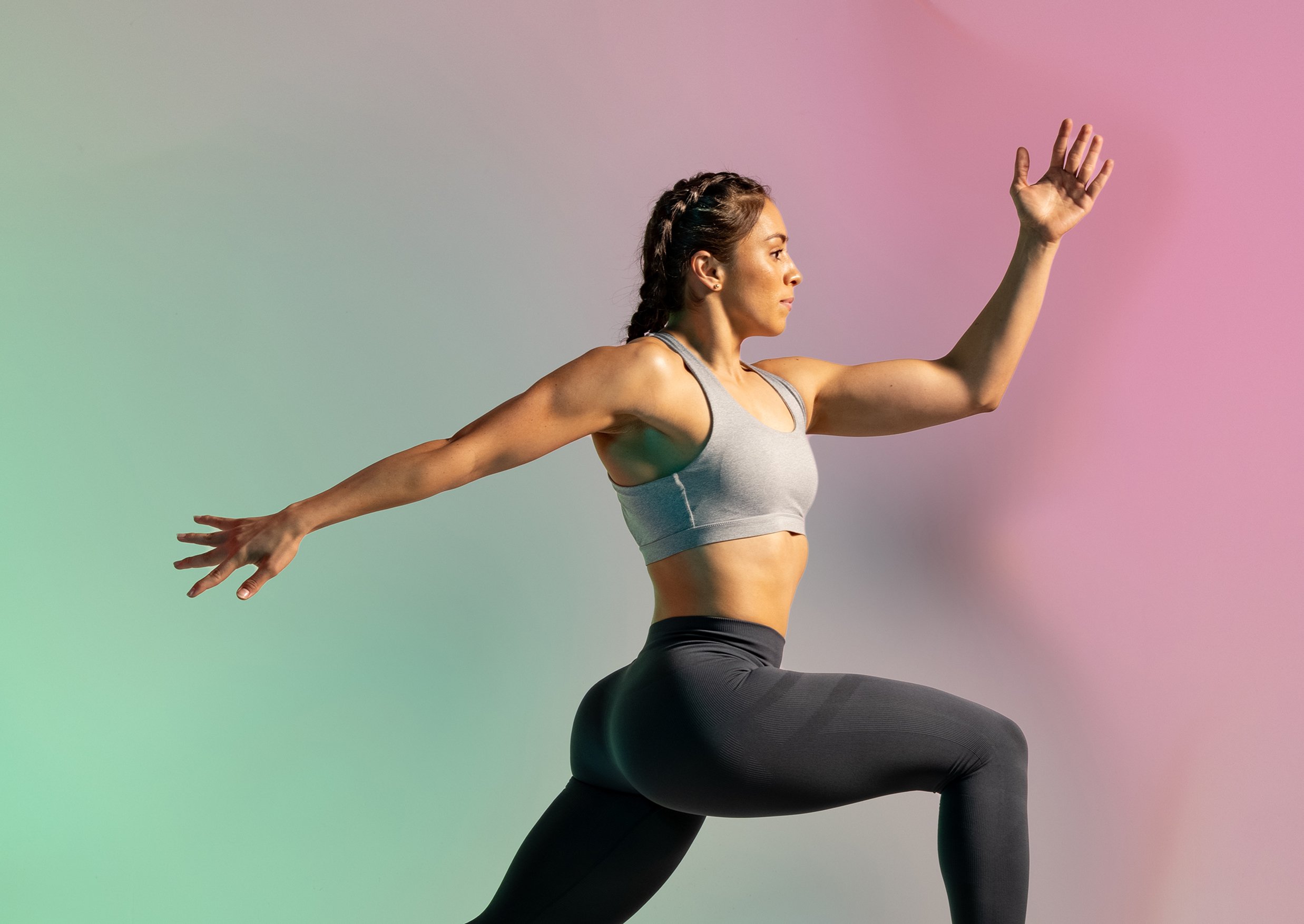
The global markets for health and wellbeing are growing at 6% per year and worth US$66 billion. As a leader in nutrition science and dairy innovation, Fonterra partnered with us to create a brand that would unlock the potential opportunities in this global wellbeing space.
We developed the brand strategy, brand name, brand identity and communication approach that enabled and accelerated this opportunity.
The brand purpose is ‘The Restless Pursuit of Nutrition’s Potential’ and the identity system is restless and confident to reflect the brand’s personality and positioning as an innovation brand offering end-to-end nutrition solutions.
__________
As Creative Director my role included: Creative Direction, Conceptual Development, Art Direction and Strategic Support.
__________________
One NZ was changing from Vodafone and their staff needed to be energised and excited for this new future. We worked with their team to revolutionize the future of their employee onboarding programme.
Onboarding was transformed from a functional event - into a fully immersive and meaningful experience that unfolds over 100 days. Inspiring each new starter and employee with all that One NZ stands for.
Guided by the idea of Growing Together - the experience is about mutual growth, collective responsibility and becoming
stronger as ‘one’.
__________
As Creative Director my role included: Creative Direction, Conceptual Development, Art Direction and Strategic Support.
__________________
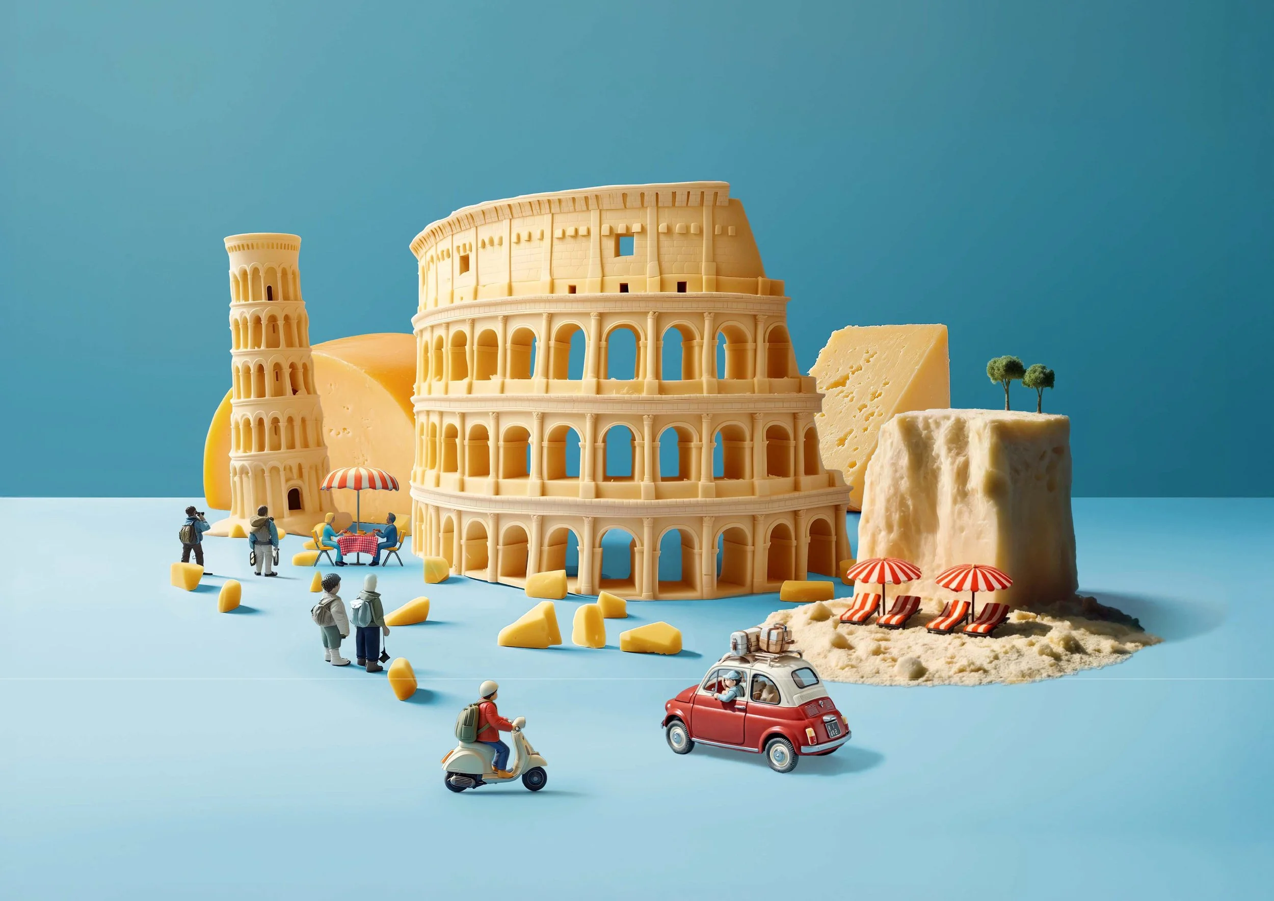
This was a B2B activation project designed to engage chefs emotionally, connect with distributor partners, and drive sales uplift across multiple SKUs.
Anchor Food Professionals turned Australia’s love of Italian cuisine into action with ‘Escape to Italy,’ a promotional campaign for Perfect Italiano cheeses and Anchor creams. Buying any eligible SKU became a chance to win an Italian holiday.
The campaign visualised the sensory joy of Italian cooking through a fantastical cheese and cream world, transforming everyday product interactions into little culinary escapes.
__________
As Creative Director my role included: Creative Direction, Conceptual Development, Art Direction and Strategic Support.
__________________
An Event Brand to commemorate the occasion of over 200 games of 1st XV rugby played between Auckland Grammar School and King’s College.
The idea that drove the design was Rivalry. The schools are 'bonded by rivalry' and the brand celebrates the shared history and intense rivalry of these two schools. The brand was developed specifically for the commemorative evening and included a limited edition book that was available on the night.
Developed at Designworks.
Design direction, design development, art direction, project management.
__________________
Packaging design for a refreshing low-calorie premium soda with unique New Zealand ingredients.
The central design feature is an intricate ‘drop of goodness’ which represents nature’s bounty and the drink’s ingredients – a combination of green tea and New Zealand fruits, infused with Manuka honey.
Developed at Designworks.
Design direction, design development, art direction, project management.
__________________
The task was to deliver a highly unique and inspirational educational experience that would set Unitec apart at the Coca-Cola Careers Expo. A dynamic, custom built stand was developed and matched with a student engagement theme called 'YouFinder'. The stand is all about finding who you want to be.
A specially developed diagnostic iPad app that matched student’s character type with their career choices was the main focus of the stand. This app was deployed on iPad's that were hung on 5m long lycra ‘umbilicals’ - freeing up floor space and ensuring the devices were tamper-proof.
Developed within a larger team at Designworks.
Design direction, design development, art direction, project management.
__________________
Transparency can be a competitive advantage. For corporations, it’s a matter of being rewarded now for their corporate integrity or mitigating risk later. Openly is an integrity accreditation platform that enables corporations to disclose information relating to their engagement with government.
Based on the core idea of ‘Championing Positive Influence’, we created a dynamic symbol that tells a story of positivity, engagement and energy. A primary palette of Red and Blue are cleverly and unexpectedly balanced throughout brand communications to represent Openly’s bipartisan approach to government and democracy.
With their new story, identity and voice, Openly is on its way to fulfilling the promise of its name – creating a more open advocacy environment and to set a new standard of conduct for public – private dialogue.
__________
As Creative Director my role included: Creative Direction, Conceptual Development, Motion Design, Art Direction and Strategic Support.
__________________
New Zealand butter is a premium dairy product with unique attributes and benefits. But these advantages were not well known among NZMP's B2B customer base.
We developed a 'myth-busting' document to position NZMP butter as the best choice for dairy manufacturers. This premium document presented the truth about New Zealand, grass-fed butter.
Developed at Designworks.
Design direction, design development, art direction, project management.
__________________
The development of an identity and signage system to launch the newly named Spark Arena. This was a complex project with multiple stakeholders and a short time frame.
We developed an identity that adhered to the Spark brand guidelines, acknowledged the Ngati Whatua heritage of the site and was still engaging and dynamic enough to signal a ‘new era’ for this iconic entertainment venue.
Developed at Designworks.
Design direction, concept development, art direction, project management.
__________________
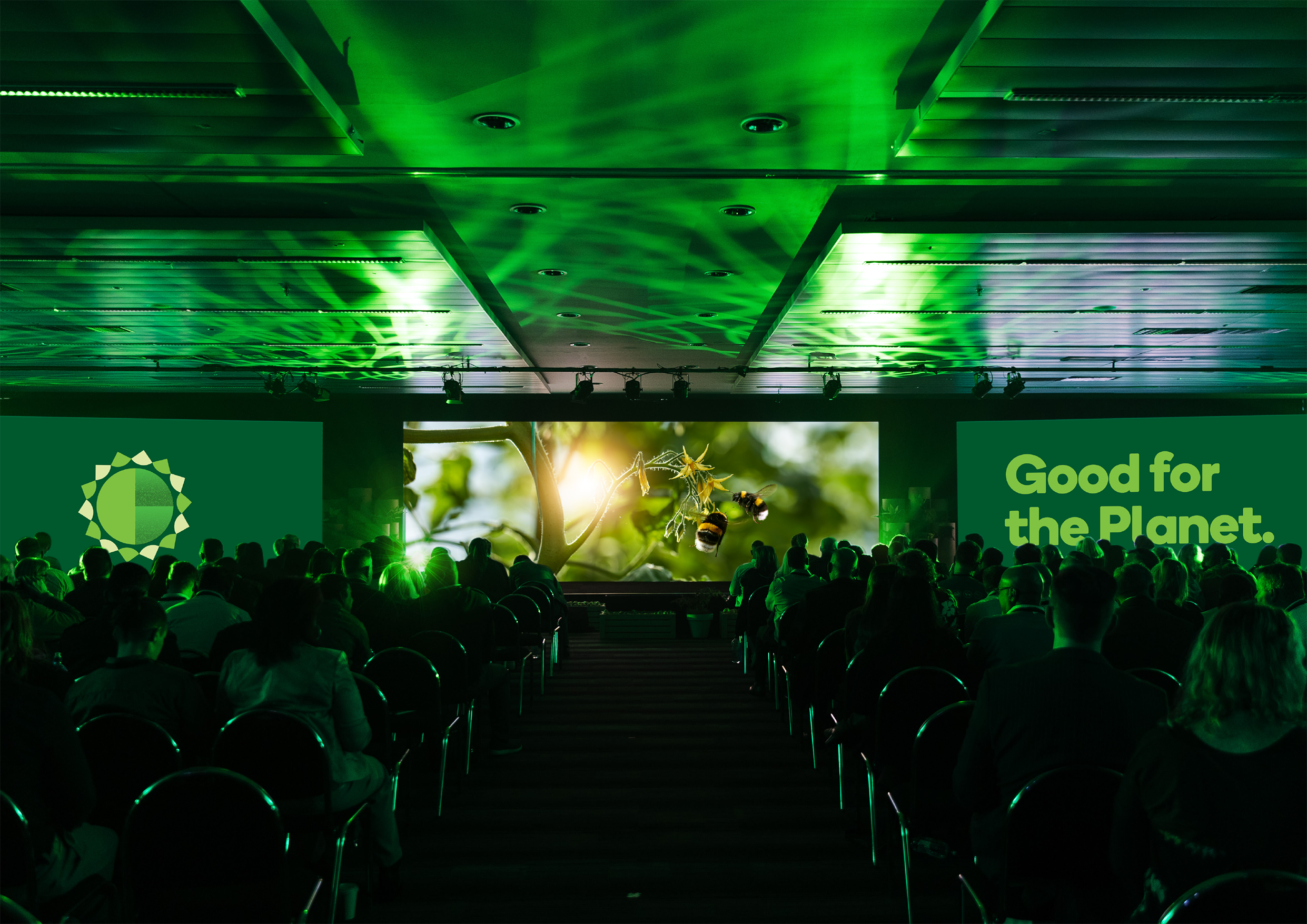
Once a year, Woolworths in New Zealand hold a staff and supplier event as a two day tradeshow. For this event the task was to energise staff, suppliers and producers about their refreshed sustainability goals and achievements.
We created an internal engagement platform and a messaging framework called ‘Green is Good’. New iconography was introduced to communicate their three core pillars; Products, People and the Planet, with support from vibrant photography that focussed on an aspirational vision of suppliers and customers.
Brought to life across physical, digital and experiential platforms this event added clarity and excitement to an otherwise functional corporate initiative.
__________
As Creative Director my role included: Creative Direction, Conceptual Development, Art Direction and Strategic Support.
__________________
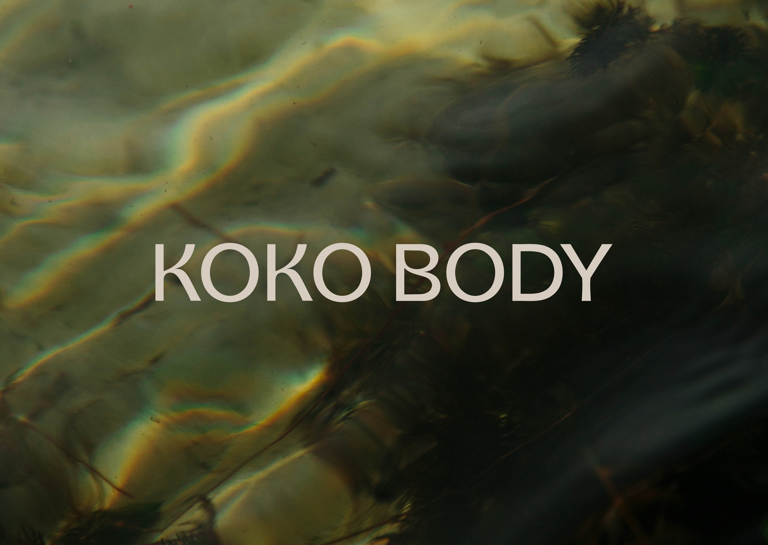
Born from a kitchen-bench experiment in natural skincare, Koko Body grew into a beloved brand with a loyal following. But after five years, it had outgrown its beginnings.
We reframed Koko Body around a single invitation: Let your self-care be a ritual. Three hero rituals - Balance, Renew and Nourish - became intuitive pathways for self-care, each tied to a distinct mood and scent family. The new identity expressed this calm, centred philosophy through a rhythmic wordmark, earthy, sun-baked palette, elegant icons and crafted, tactile illustrations.
Every detail was designed to breathe - to evoke the same sense of stillness and flow that sits at the heart of the brand. The revitalised Koko Body feels both grounded and elevated - a brand that invites pause, not performance.
__________
As Creative Director my role included: Creative Direction, Conceptual Development, Art Direction and Strategic Support.
__________________
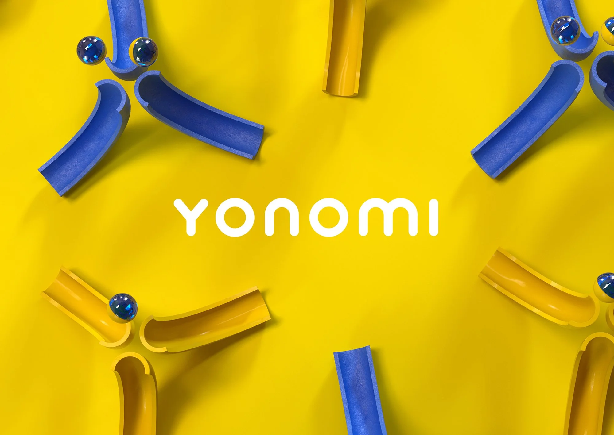
We worked closely with our US-based client Allegion, to strategically reposition Yonomi for the smart access and security market. Yonomi is a secure cloud-based platform that makes integration and deployment of the Allegion range of smart, secure solutions easy and fast.
We delivered a refreshed, evolved brand story and brand identity that accurately reflects the shift towards a responsive developer experience. At the core of the identity are a series of dynamic, motion treatments that connect to the idea of Frictionless Potential.
As a brand with a wide range of touchpoints and channels, we needed to create a design system that was simple and boldly dynamic.
The refreshed brand uses a range of typographic treatments, 3D Renders, photography and iconography, to give Yonomi a dynamic and expressive toolkit fit for the future.
__________
As Creative Director my role included: Creative Direction, Conceptual Development, Art Direction and Strategic Support.
As a note: In 2025, Allegion decided to absorb the Yonomi brand under the Allegion masterbrand.